This post will look at notes and ideas which were brought up during the July seminar week. There were many things which I believe could have been changed to be better and make the exhibition install read better and become more specific and interesting to an audience.
I’ll start with notes thanks to Alan:
-Is tunnel hide bait station
-Trap to find insects
-evidence of who has been in a ‘space’
-light shaft
-black ground
-tonal modelling
-peters out into black void
-reminds panel of McCohan- Northland
-forms of trees- denuded strong message about colonialization
-what challenges in weed matting
-canvas feel- absorbs paint more
-is weed mat important- Suburban demand, is building site nearby?
-weed mat not recyclable?
-construction site materials break down
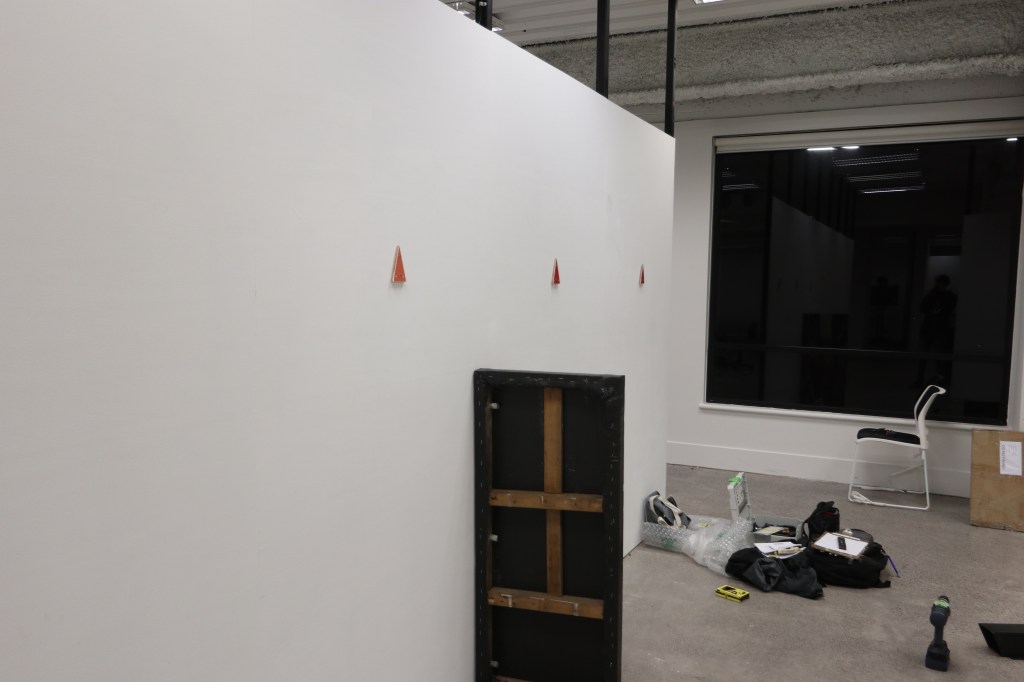
-track markers- What does it mark? The track
-dark orange and red ‘testing colours’
-seeing revealing background as sections relating to housing market
-is the material being hidden? Demolition timbre forming
-could hang off the wall to expose the structure building materials as well
– hang over the edge of the wall
-reused nails, eyelets and signs?
-temporary fence zip tied to it? Check Melanie!?
– gallery in Devonport slide pullouts with mesh (storage)
-human elements of all but one painting has a human form? Same and opposite going on
-opposite colour wheel
-markers interesting in urban environment orienteering
-A frame object, if upside down what do they mean?
-realestate magazines! Found block of land and paint it- reinforce the commodity aspect
-land is resistant fish in waterways
-this painting differes in texture? How it plays with light like a water colour effect.
-transparent passages are lost in the way behind
-David Hammonds- oil abstract covered in tarp with washes when you can see the painting beneath
-cover up the painting hiding another layer on top
-builder on building site adding layers to their person, then think adding layers to the work too.
-human size tracking tunnel- invisible ink UV light.
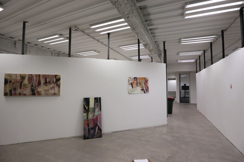
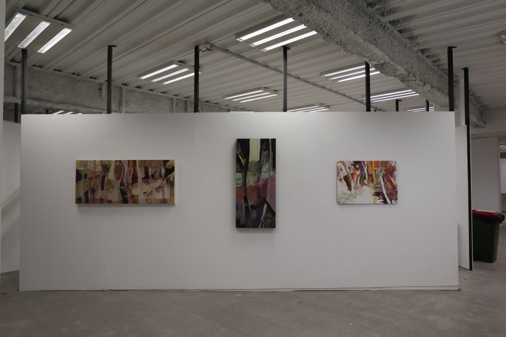
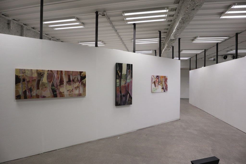
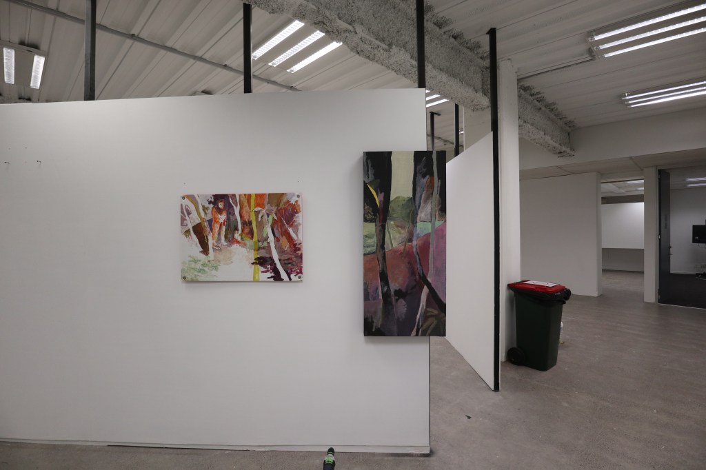
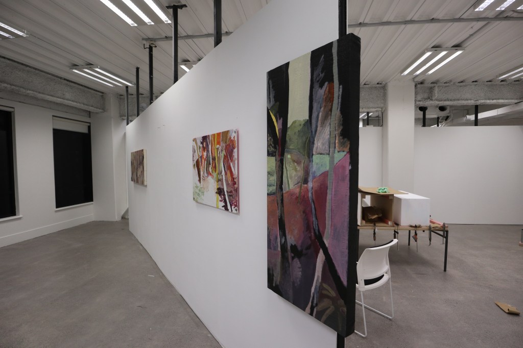
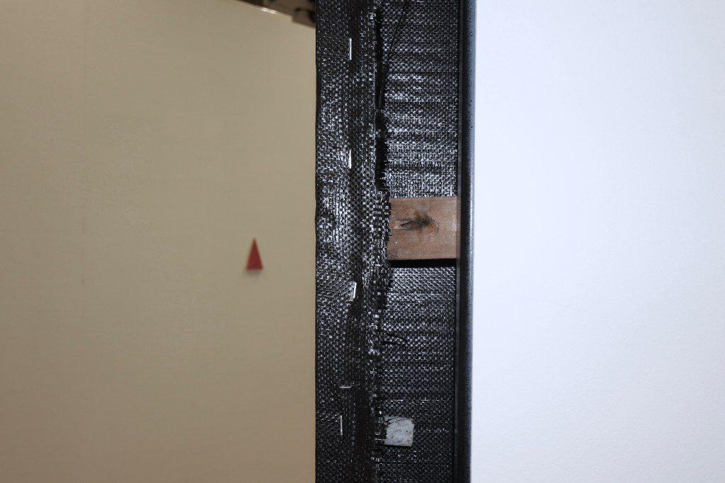
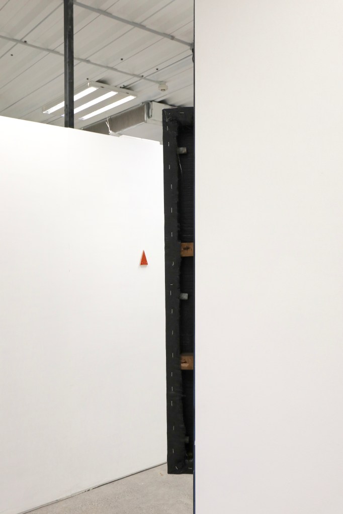
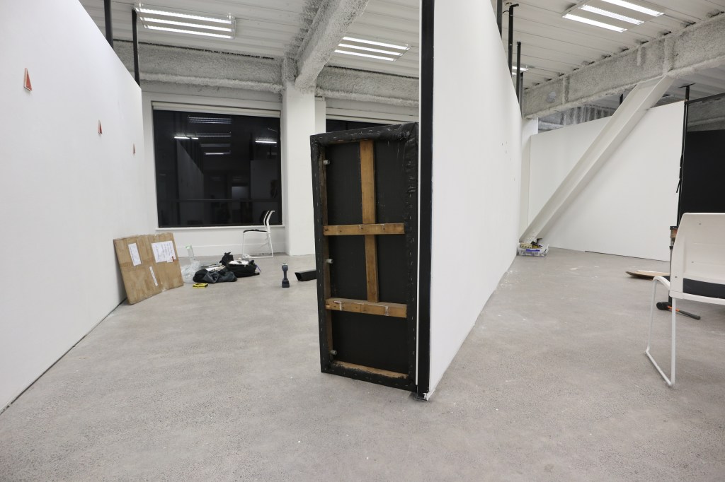
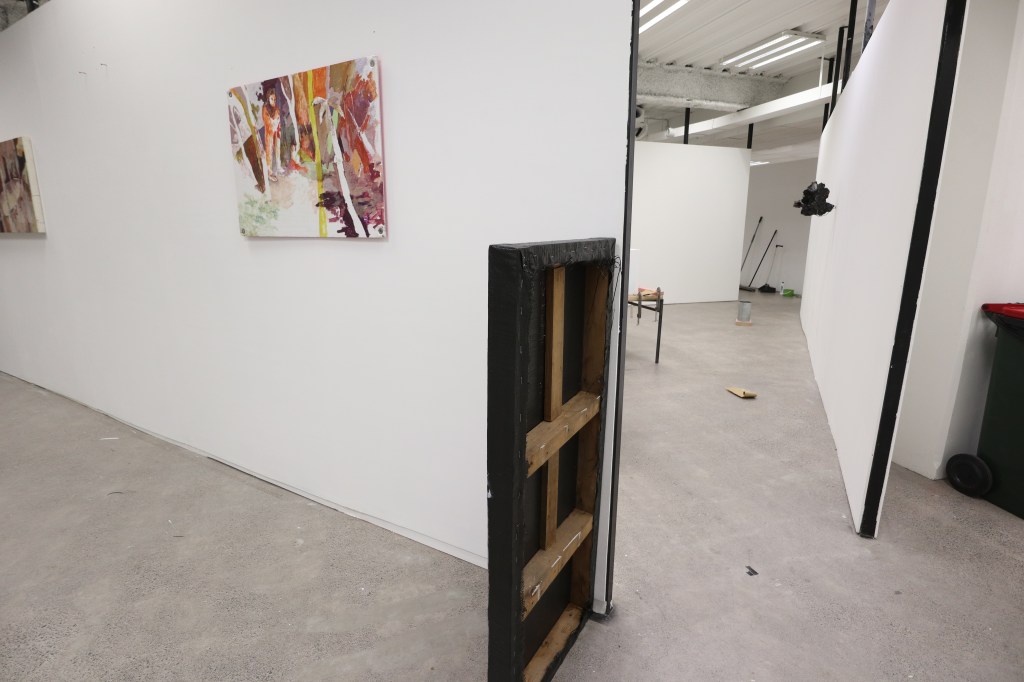
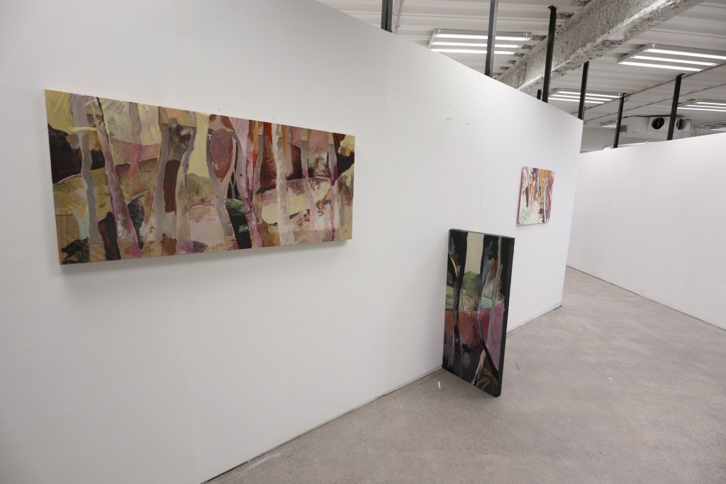


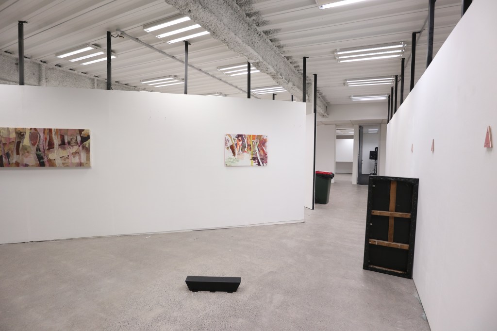
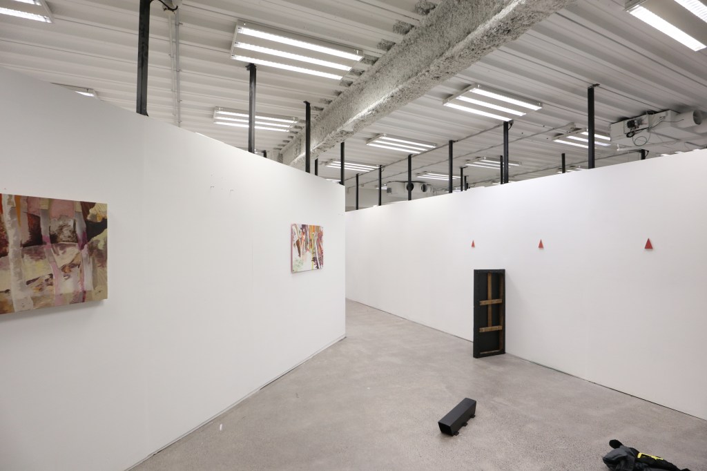
The tall black painting was, to me, a difficult one to place as its back seemed like an important thing to expose as it held a lot of meaning and may have given more meaning to the exhibition and adding more, hiding the wooden backing made the thick boarder feel out of place and intruding.
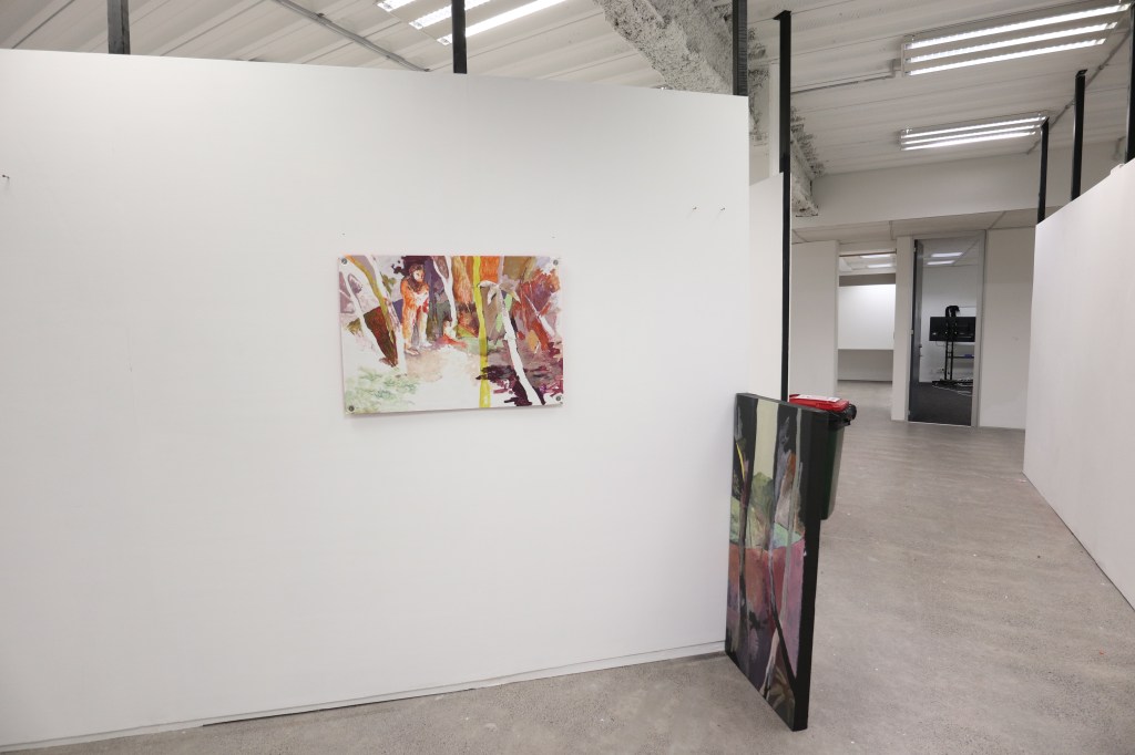
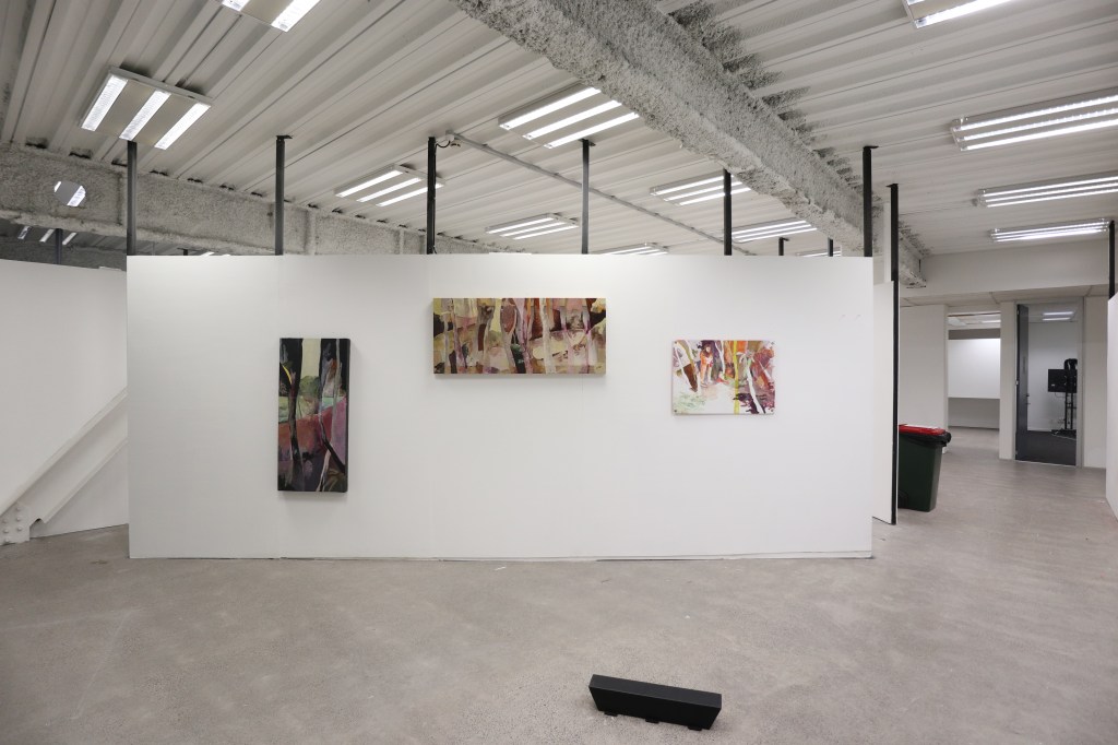
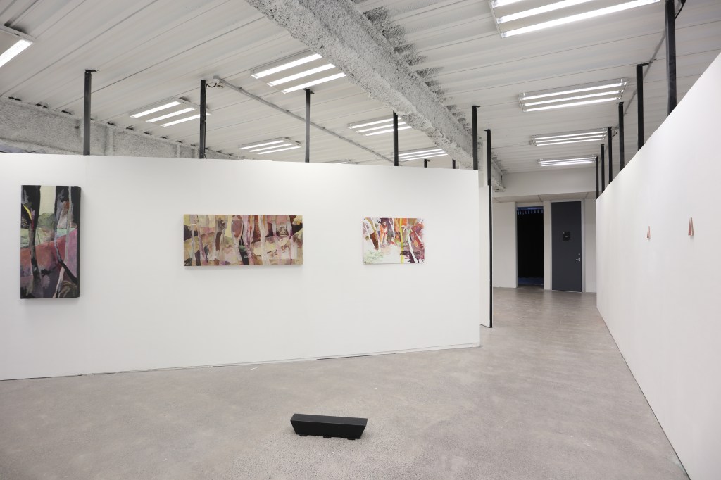
After a lot of discussion and a meeting with lecturers a possible ‘better’ installation was brought up, hinting at a sort of “less is more” approach and not bombarding with so many references which became distracting especially the painting with a figure which was more problematic than I thought would happen, to me it felt like it was talking to something different to what it may had been read as and that it would have been better not there or approached differently, maybe even more people or less distracting of a figure, especially making it bright orange contrasting with the surrounding ground could have been approached differently.

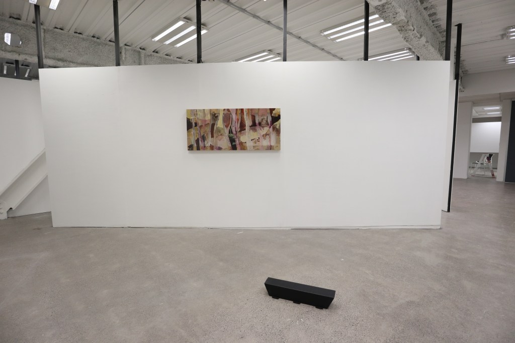

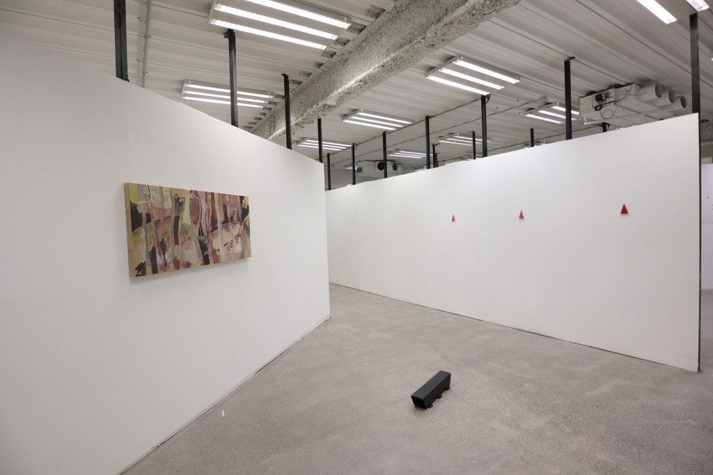
This install strategy is what was proposed to be a more cohesive read, although to me this feels fairly empty, I do see this working as a possibly iteration of the work in a space and creates a reading which may have been more concise and also talks a lot more to the light use and importance and isn’t distracted by any of the additional meanings from the other objects. To me I’m glad that I did what I did do but in hind sight could have approached the install in a more cohesive manner and choose to refine the installation instead of trying to force a work to fit in rather that realising its absent potential.
