Laura Owens

https://www.owenslaura.com/piece/lo-207/lo-207-rgb-color-corrected-web/?e=15339
Laura Owens paintings play with texture, layering and exploring space seemingly through materials. Paintings have a clear sense of imagery but testing the materials such as with the monkey as paint seeps into the canvas it sits on creating a fuzzy texture, bark of trees feel textured through layering and paints sitting next to the soft flat green landscape, there are also a lot of included blue animals and green, although there are many objects in this painting they never feel as if they are dominating the scene.
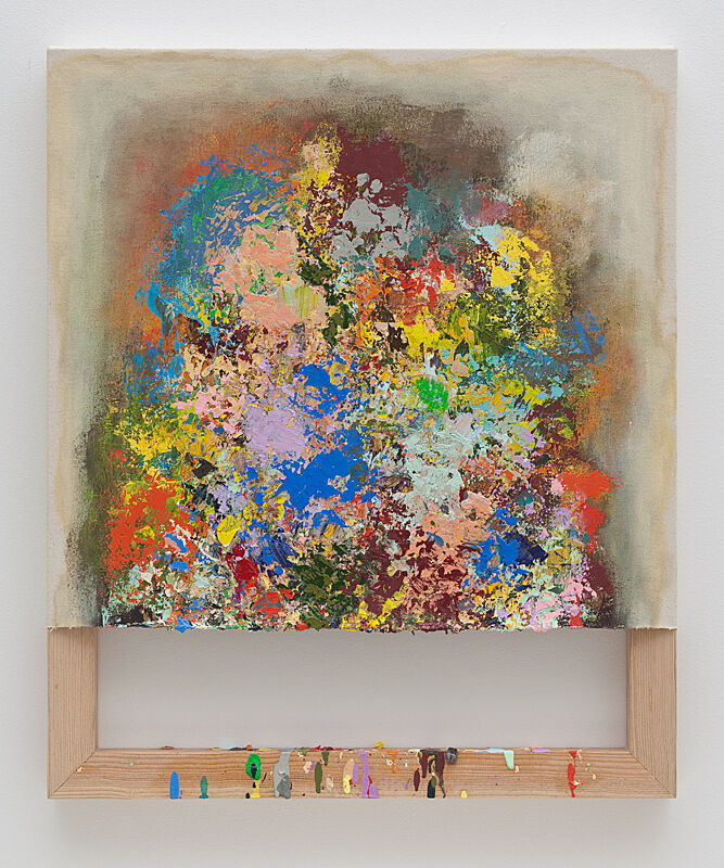
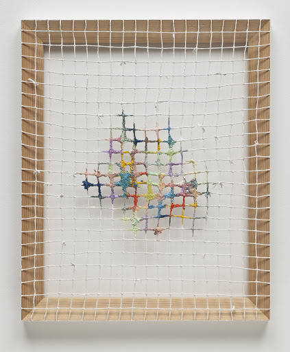
Dianna Molzan
https://whitneymedia.org/assets/image/292767/large_molzan_web.jpg
https://lh3.googleusercontent.com/proxy/ni1tN-HOG2-vPnXqfxSdNPIfJhP-v80i5hgkiI7xeqBlwdM5x1UjCw4VcsVSOuS4X-sS0FJxMrvb0gq7JEHRP8WS9U3cm6FswFlfDg07-OYN53TzQJEfqpGXDJRMByhs6yrtlAw767euhLPw6e2c4Q
The play between material and paint and painting really works within these works, the canvas backing is very present in the works, there is a subtle presence of colour but also is holds its self, the paint drips in the work on the left create a balance to the paint which is above, it feels alive. The work on the right holds a small portion of paint but the paint is present, the canvas dictates how much is being shown. The paint becomes a material the can play many parts other than just being something which is to depict but can hold its own and tell its own story and how it’s own weight, Molzen does this beautifully in her work.
Ana Iti

https://www.aucklandartgallery.com/whats-on/exhibition/takoto
Ana Iti draws from the history of Tāmaki Makaurau. What I enjoy and connect from this work is the materials connection to location and space but also the physicality of the work and how it is placed in space, the simple nature of them being white and being held at different angles. It works in the location speaking the Albert park. Learning about the work and the history of the wall brings a meaningful understanding to the project and the wall remnants.
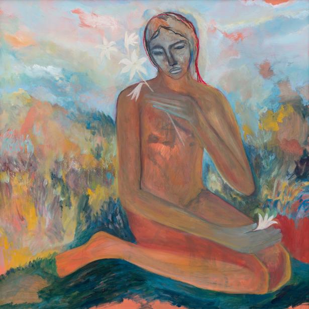
Star Gossage
https://mediacdn.grabone.co.nz/asset/LXWedm9w2F/box=615×0
Star Gossage draws from peoples relationship towards the land, the people depicted in her work are not anyone in specific. The way in which wāhine artist Star Gossage paints is emotive and holds a lot of power in the brush strokes, there is energy but also a delicate approach.
“She is the whenua, she is literally part of the landscape.” (Star Gossage in Andre Chumko. 2020) There is an interconnectivity to the whenua/ land which is apparent and strong in the paintings.
Andre Chumko. 2020. Artist Star Gossage on impressionism and the unconscious realm. Retrieved from: https://www.stuff.co.nz/pou-tiaki/123434131/artist-star-gossage-on-impressionism-and-the-unconscious-realm
Barbara Tuck

https://annamilesgallery.com/artists/barbara-tuck/
Barbara Tuck creates incredible land scape paintings including a variety of imagery and view points, the horizon line changes in sections of the work even when there is a sort of ‘finish’ view it still jumps around making the eye move in and out of areas of the surface. Figures added do not dominate the scene but add they are not distracting but are present in the work. I enjoy the use of colour tones used, there is vibrance but it is also pushed and pulled with more washed colours and hues which ease the viewing of the works. the works are beautifully painted through a variety of techniques leaving space for the eye to travel and rest.
Yolunda Hickman

https://www.yolundahickman.com/cutwork
Layering and layering until the images become unrecognisable. Yolunda breaks up information through pattern / colour and imagery. I am drawn to the way in which imagery which is familiar in some sense can become distorted and unfamiliar, these recognisable figures become abstracted through manipulation. These cut outs help me to understand my own practice and how I can use layering to enhance works and to use it to create and ‘otherness’.
Ayesha Green

https://windowgallery.co.nz/thumbs/exhibitions/for-karetoki/_43a6261-879×1000.jpg
Ayesha Green Creates images of images in her signature painting style, having solid blocking of colour and quite flat, replications of images relate to her whakapapa. The idea of a replication and multiple replications is interesting in its self especially with dealing with the ideas and histories which Ayesha plays with, the additional flattening comes into this replication, the works meaning are heavily sat within what is being depicted instead of how it is done although it is very much a communication of Ayesha when done in a specific style and makes her own voice present in all her paintings. The stories are not lost on the view but our attention seems to brought to them in a different manner than what usually may be, it feels accessible even if thats not the point.
Imogen Taylor

https://mccahonhouse.org.nz/residency/alumni/imogen-taylor
Imogen Taylor pulls from art history and holds a strong position while playing around with these ‘formal’ aspects. I quite enjoy her play with material and shape of canvas breaking from the traditional rectangular or square canvas which seems to be the ‘standard’, this playful approach adds to the work and plays into the geometric depictions within the paintings. The approach to colour is remarkable, colour choices which I find myself wanting to go back to when viewing her work, some vibrant colours apparent but they are worked and developed and thought through, the paint sticks up and holds onto the back, when seeing her work in the flesh the paint is present and juicy, the hessian plays into this material engagement and language. I enjoy the play with historic methodologies and the shift of that as well.
Jacqueline Fahey

https://www.aucklandartgallery.com/explore-art-and-ideas/artwork/6174/final-domestic-expose-i-paint-myself
Jacqueline Fahey creates paintings often encorporating text and collage. These paintings are layered incorporating multiple imagery, there is a real sensibility to subject and story. The textures formed through collage create a brilliance in contrast, areas are flattened and others speak through the paint, bringing importance to the ‘real’ as in taken from photographs along side the gestural and figurative painting.
Nicola Farquhar

https://mccahonhouse.org.nz/residency/alumni/nicola-farquhar
Attention to material, surface, paint and imagery the figure has a relationship with foliage emerging through. Vibrant colours play off of each other, the paint is not shying away but living, the layering exposes parts of the paintings pattern behind, the layers play off one another. Although the figure and foliage aren’t painted to fully depict what they are they are also very much visibly apparent. I am intrigued with the addition of the objects that sit on and along side Farquhar’s work.
Sandra Bushby
https://melanierogergallery.com/stockroom/sandra-bushby/2244
Sandra Bushby creates abstract paintings which are quite painterly in nature. The washes of paint next to the more confident brush marks create a real distinct contrast and awareness to material and play well into ideas of exploration and letting the making process become apparent in the work as much as the finish. there is time and attention given to the making and the world that surrounds the paintings. I always enjoy focusing on colour and the pallet which Bushby plays with is stunning, the red in the painting is very bold but pushed back and sits comfortably next to the brown and navy like blue.
Miranda Bellamy & Amanda Fauteux – RM gallery and Blue Oyster


This cross over show is an involvement of two galleries and artists where the work exists in different ideas or installations but seem to communicate really well. RM gallery hosted an array of video screens and Blue oyster gallery showed a large tree trunk slicked up long ways taking up a large amount of room. This work would have been amazing to see physically but I am glad I can experience some of it online.
Nancy Lupo

https://jan-kaps.com/exhibitions/nancy-lupo-nancy-lupo-scripts-for-the-pageant
Nancy Lupo plays with real world object such as these public benches which have been displayed in a way that they sit in an oval / circular shape in the gallery space. These are not the real benches but remakes to a different dimension to the originals. Nancy has remade them and installed them in similar positions (the oval or circle) but in different locations, some in galleries and some as outside installations. The ideas of public objects becomes a very relevant idea to myself through looking at everyday objects specific to a certain location and how they are to be made or remade physically.
Rachel Whiteread

https://gagosian.com/artists/rachel-whiteread/
Rachel Whiteread takes inspiration from everyday settings and objects, there is a heavy set and inspiration from the lived in such as buildings and infrastructure, this is implemented by replication but also materials used throughout her practice. The focus of buildings is of interest to myself and the built but built through the self and these ideas of replication with a sort of understanding and focus towards playing with the materials used and their own meanings and significance within the structure and space. Whitehead seems to deal with her own understanding and positing to objects made and her own experiences and background with being with these objects where as it may be a bath tub or a large building.
Karla Black

https://www.nationalgalleries.org/sites/default/files/2011_KB_Doesn_t_Care_In_Words_01.jpg
Karla Black uses ready materials, focusing on sculpture and using these found materials to create large structures and forms. She is interested in performance as making and the childlike mannerisms of making, these structures really play with installation with consideration towards how viewers will be living and experiencing the objects / sculptures made. The colours are pastel coming from often pigments found, Black likes the ideas of playing with ‘non-art’ materials not to avoid art materials but to make these everyday materials be present. The idea of the use of found material but being presented in this manner is something which I find of importance in my own making and decision making and how I present the materials considered within my own making.
‘I tend to think of the materials as something that I can’t help but use, something that comes out of desire, out of the unconscious.’ (Karla Black quoted in Black, p.178).
Emily Karaka

Photo taken by: Llenyd
Emily Karaka is a Wāhine artist who creates paintings. The painting in the middle is written in te reo Māori, named are a few native plant species, these species are played in a variety of ways through the show, sometimes physically existing in the work such as the work on the left which has Kauri leaves incorporated in to the work. Karaka’s approach to painting is fantastically aided by her use of brush marks, paint and colour choices, there are parts which appear blocky but in the most part the paint plays both as being worked into and on top of being thick and pasty there becomes a physicality to the work this is also aided by the incorporation of leaves.
Hannah Ireland

https://ocula.com/art-galleries/jhana-millers/artworks/hannah-ireland/if-only/
Hannah Ireland creates these works on glass using a water based house paint manipulated by water colour paint on the back of glass, the figures painted are flattened by the glass, showing the side of painting which is not often shown to the viewer traditionally, the backside of the glass. The paint as medium becomes flattened as brush marks become more apparent, the washes of paint mixed with water colours run thin and smooth across the glass surface, the glass too plays a part in the depiction allowing the paint to spread more easily not soaking as fast as if it were painted on canvas or paper. The thickness of the glass is between the painting and the viewer representing a connection to the single mirror placed within the show. Painted frames are matched up to the paintings, almost personalized to each character or person. These frames also carry a thickness to them, matching the thickness of the mirror which is hanging at a height working in unison with how the paintings are displayed.
Cat Fooks

https://annamilesgallery.com/artists/cat-fooks/
Structural painting objects sit upon the wall, textures of the paint plays off of the other mixed medium added to the surface. Fooks paintings are raw and thick in use of materials they feel structural. The physical nature of materials is confident and adds a lot to the work, seeing them physically in space creates a very sculptural element, I find myself walking around these object orientated paintings seeing the work in multiple directions and seeing how the light and shadows play within the work. Cat Fooks has also made a variety of sculptures where materials are treated similarly and become structures and sculptural where colour and the physical paint is apparent and present.
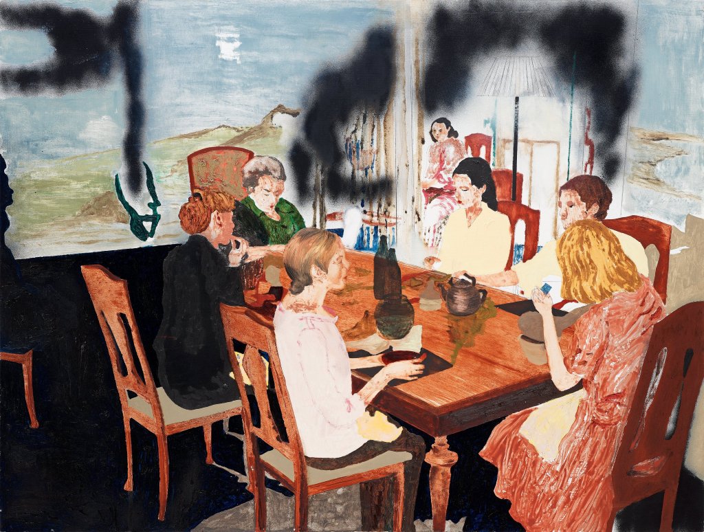
Karin Mamma Andersson
https://www.flickr.com/photos/gandalfsgallery/11599918853
Karin Mamma Anderson is a Swedish artist who paints a variety of subject matter often grasping on the domestic and often skews perspective and slightly shifts the view and information provided to a viewer. Her paintings often draw from previous made works around her studio through replication, historic paintings and photographs. There is a sense of playing with the viewing of works, often slightly shifting the viewing of a setting which may appear familiar or obvious. The approach to the way the canvas is set up and used is important to myself, they are often not left as just a surface which the painting sits upon but are helping in the story telling. Disrupting the painting but also seeming to be of a single depiction also plays with the reading of the paintings, there are multiple approaches to painting going on, sometimes there is a close in focus at a moment and at other times it is more expressive or focusing toward the paint as a medium.
